Creative Best Practices for Spot-the-Difference Games in 2026
Creative Best Practices for Spot-the-Difference Games in 2026
Spot-the-difference is one of the rare mobile game formats where users can start engaging with the gameplay before they ever tap. The user sees two similar images and, almost automatically, begins scanning. No long tutorial. No premise to decode. No new mechanic to learn.
That is why the format continues to show up in playable and video creatives for puzzle and casual games. It is not necessarily the newest or most aggressive creative direction, but it has a durable advertising advantage: participation begins almost instantly.
For 2026, the best spot-the-difference creatives will not win by making the mechanic more complicated. They will win by making the first second clearer, the progress state more motivating, and the production system easier to scale.
.jpeg")
The Core Insight: The User Is Already Playing
Many mobile game ads spend their opening moments explaining what the user is supposed to do. Spot-the-difference can skip most of that work. Once the comparison images appear, the user understands the task and starts looking for visual inconsistencies, even if the ad is only a video.
This changes the creative strategy. The job is not to teach the game from zero. The job is to protect the user's instinct to participate.
That means the first screen matters more than the headline. The image pair needs to be readable. The differences need to feel discoverable. The interface should support the search instead of competing with it. A cluttered opening screen can weaken the format's biggest advantage before the user has a chance to engage.
The Creative Levers That Matter Most
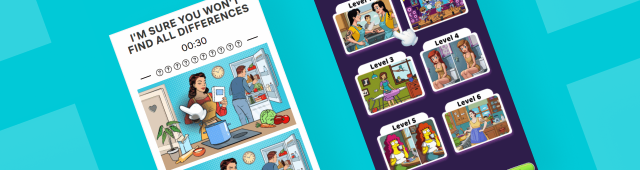
1. Make the puzzle readable in one second
The two images should carry the ad. UI can help, but it should not dominate the comparison area. A clear "Find 5 Differences" prompt, visible progress dots, and one easy first difference are usually more useful than extra badges, claims, or decorative effects.
For playable ads, this creates a low-friction first tap. For videos, it gives viewers a reason to keep watching because they are already searching.

2. Use progress as the emotional engine
Progress dots, target counts, countdowns, and lives may look like simple UI, but in this format they do much of the emotional work. They tell the user how much has been solved and how much is still unresolved.
That unresolved state is valuable. A creative does not always need to finish the puzzle. In many cases, stopping when the user is halfway through, one difference away, or under time pressure can create more click motivation than showing the full solution.

3. Add challenge without changing the rules
Timers, limited mistakes, IQ labels, and fail states can refresh a familiar mechanic without making it harder to understand. The point is not to turn spot-the-difference into a different game. The point is to shift the emotional pace from casual observation to light challenge.
This is especially useful when a basic comparison layout feels too flat. A countdown or mistake limit can add urgency while keeping the core interaction intact.

4. Make the product feel bigger than one puzzle
One common weakness of spot-the-difference ads is that they can look like a single isolated puzzle. Level-selection screens, thumbnail grids, "next level" prompts, or a brief level wall can solve that problem by suggesting content depth.
This layer is not about teaching the mechanic. It is product packaging. It helps answer a quiet user question: "Is there more to play after this?"

Playable and Video Creatives Need Different Restraint
The same insight can be expressed differently across formats.
Playable creatives should give the user just enough control to feel the loop: find a difference, receive feedback, see progress move. The strongest versions usually stay short. They do not need to prove an entire level. They need to make the first few interactions feel obvious and satisfying.
Video creatives have a different job. Since the viewer cannot tap, the ad needs to preserve mental participation. Static puzzle displays can work because the viewer does the searching internally. Finger-demo videos add rhythm by showing correct taps, wrong taps, highlights, and near-completion moments. Pop-up interruption formats are more direct: they keep the puzzle in the background while pushing attention toward a single action.

The practical question is not "Which format is best?" It is "What kind of unfinished state are we testing?"
| Creative approach | Best use case | What to avoid |
|---|---|---|
| Static puzzle display | Letting viewers search on their own | Solving too much too early |
| Finger demonstration | Making feedback and rules obvious | Over-teaching the full puzzle |
| Timed or limited-mistake challenge | Adding urgency to a familiar task | Covering the image area with pressure UI |
| Level-selection packaging | Communicating content depth | Spending too long before gameplay |
| Pop-up interruption | Driving a short, direct click path | Losing category recognition in the background |
A Better Testing Framework for 2026
Instead of treating every new creative as a fresh concept, teams can test spot-the-difference ads as a modular system. The mechanic stays stable; the variables change.
Start with five questions:
① Which image theme is easiest to read in the first second?
② Does the ad perform better when the user sees no progress, partial progress, or "one left" progress?
③ Does light pressure, such as a timer or limited mistakes, improve engagement for this audience?
④ Does a level wall or selection screen make the game feel more complete?
⑤ Should the ending stop after a correct tap, near completion, a fail moment, or a direct CTA?
These questions keep testing focused. They also make the format easier to scale across languages, aspect ratios, scenes, and campaign needs.
The Production Implication
Spot-the-difference is a strong fit for template-based creative production because its structure is stable. The layout, progress UI, feedback animation, and ending logic can stay consistent while teams rotate image themes, difference placement, challenge settings, copy, language, and CTA timing.

Playturbo Template
For teams using Playturbo, this translates into a practical workflow: establish the base interaction with playable templates, adjust challenge parameters in an editor, and adapt video or image variations for different placements and markets. The value is not that the tool decides the creative strategy. The value is that it reduces repetitive production work so teams can test the strategic variables faster.

For this genre, that distinction matters. The creative idea is simple. The operational challenge is producing enough disciplined variations to learn what actually changes user response.
Final Takeaway
Spot-the-difference ads work because they turn looking into participation. The strongest creatives protect that instinct: they make the puzzle clear, show progress, add only enough pressure to create momentum, and stop before the viewer feels fully satisfied.
In 2026, the opportunity is not to reinvent spot-the-difference. It is to treat it as a reliable creative system: simple enough for instant engagement, flexible enough for testing, and structured enough for scalable production.
Ready to elevate your ad strategy? Explore Playturbo's innovative solutions and discover how we support developers to generate high-performing AI ads at scale. Follow us on LinkedIn to keep track of all our updates. Contact us today to kickstart your journey with video ads!